
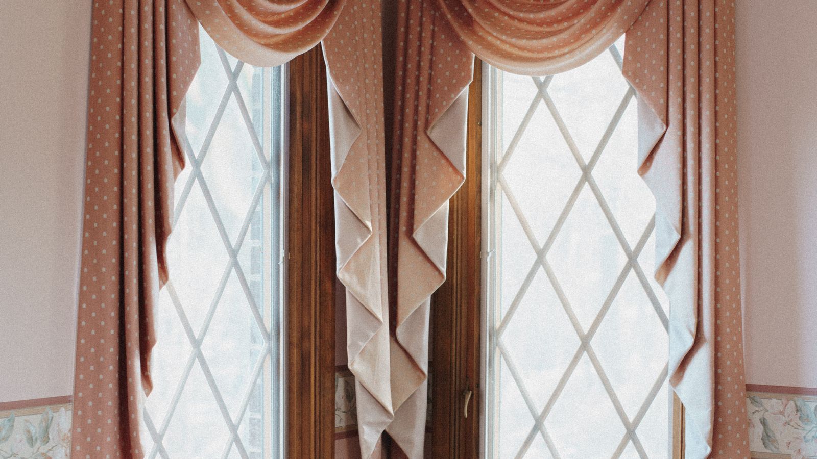
Pairing a decorative valance with a room darkening panel is one of the easiest ways to get a window that looks professionally designed while still blocking unwanted light. The trouble is that most people buy the two pieces separately, on different days, without a plan – and end up with a mismatched fabric, an odd color clash, or proportions that make the whole window feel off-balance. This guide walks through a simple, repeatable process for matching a valance and a room darkening panel so the finished look reads as one cohesive treatment rather than two unrelated pieces stacked on top of each other.
What You Need Before You Start
Before shopping for fabric or scrolling through listings, gather a few basics. Having these on hand prevents the most common mistake: buying pieces that look great individually but clash once they’re hung together.
- A tape measure and a notepad for recording window width, height, and mounting height
- A photo of the room in natural daylight (colors read differently under bulbs)
- Swatches or paint chips from the wall color, flooring, and any large upholstered furniture nearby
- A rough budget split between the valance and the panels
- The room darkening panel you already own or plan to buy, if you’re starting from that end
If you haven’t chosen either piece yet, start with the room darkening panels first, since they set the base color and fabric weight for the whole window, then choose a valance that complements them.
Step 1: Decide Which Piece Leads the Design
Every successful pairing has one piece that sets the tone and one that supports it. Trying to make both pieces equally bold usually backfires – the eye doesn’t know where to land, and the window feels busy instead of intentional.
- Let the panel lead if you want a calm, restful room. Choose a solid or subtly textured room darkening panel in a neutral or muted tone, then pick a valance in a complementary pattern or a slightly richer shade of the same color family.
- Let the valance lead if you want personality at the window. Choose a valance with a print, trim, or bold color first, then select a solid room darkening panel that pulls one of the valance’s secondary colors.
- Avoid pairing two patterns of similar scale. If both pieces have prints, they should differ noticeably in scale (a large-scale print with a small geometric works; two medium florals fight each other).
Step 2: Match Color the Right Way
Color is where most mismatched window treatments go wrong. The panel and valance don’t need to be the exact same shade – in fact, an exact match often looks flat under artificial light. Instead, aim for coordination.
- Pull from the same undertone. If the room darkening panel is a warm ivory, choose a valance with warm cream, tan, or gold undertones rather than a cool white or gray-based fabric.
- Use the 60-30-10 rule loosely. Let the panel cover the largest color share (60%), the valance introduce a secondary color or pattern (30%), and trim, tiebacks, or hardware carry a small accent (10%).
- Test swatches against your actual wall color, not a screen. Photos and monitors shift color temperature; hold physical samples up in the room at the time of day you’ll see them most.
- When in doubt, go tonal. Two shades of the same color family (e.g., a deep navy panel with a lighter chambray-blue valance) is nearly foolproof and reads as deliberate.
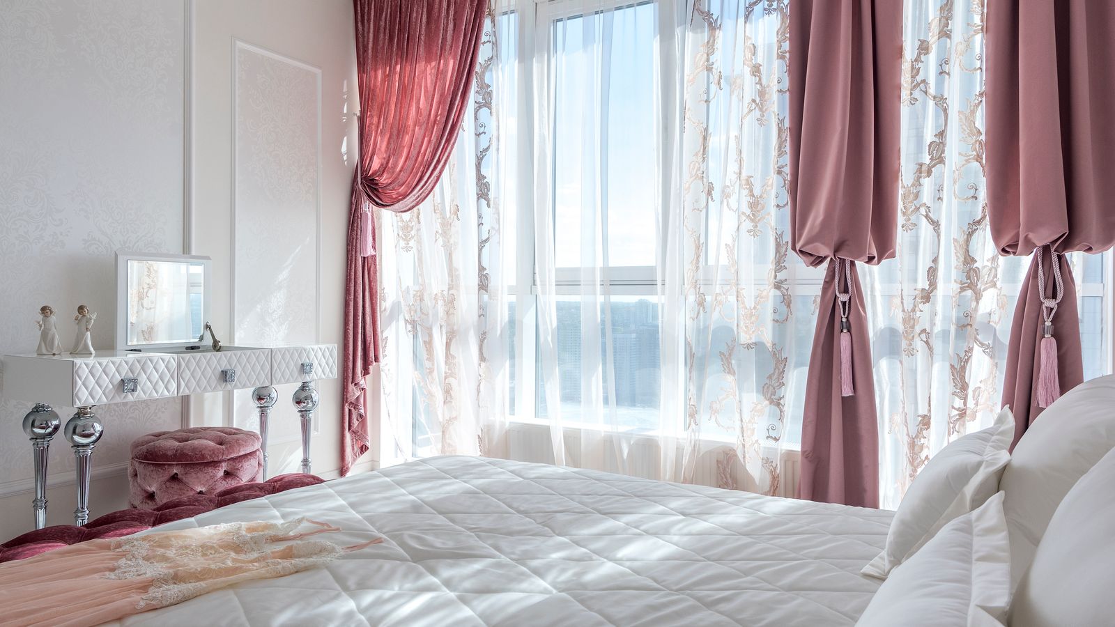
Step 3: Get the Proportions Right
Even perfectly matched colors will look wrong if the valance and panel are sized incorrectly relative to each other and the window. Proportion is what separates a designer-looking window from a thrown-together one.
- Size the valance to roughly 15-20% of the total window treatment height. On an 84-inch panel, a valance around 14-18 inches deep typically looks balanced; anything shorter can look like an afterthought, and anything much deeper competes with the panels.
- Mount the valance rod 2-4 inches above where the panel rod sits, or use a double rod set so the valance sits slightly forward and higher than the panels, creating visual layering rather than a flat overlap.
- Match the fullness. If the room darkening panels are gathered to 2x fullness, choose a valance style (gathered, pleated, or scalloped) with similar visual density so one piece doesn’t look sparse next to the other.
- Keep the panel width generous. Panels should typically total 2-2.5 times the window width when closed, so they read as full drapery rather than skimpy strips flanking the valance.
Step 4: Choose Complementary Textures and Finishes
Texture is often overlooked, but it’s what makes a pairing feel curated rather than coincidental. A crisp, structured valance paired with a soft, flowing room darkening panel can look intentional, while two very different weights of fabric can look accidental.
- Pair a structured, tailored valance (box pleat, cornice-style) with panels in a smoother, matte fabric for a formal look.
- Pair a relaxed, gathered valance with panels that have some drape and movement for a softer, casual feel.
- If the room darkening panel has a slight sheen or subtle texture, echo that finish somewhere in the valance – trim, lining edge, or a matching fabric blend – so the two don’t feel like they came from different rooms entirely.
Step 5: Test the Full Look Before Committing
Once you’ve chosen candidates, do a trial run before ordering final quantities or cutting anything to size.
- Hang a single panel and clip the valance temporarily above it, even with binder clips, to see the real proportions in the room.
- View the window at different times of day – morning light and evening lamp light change how colors and patterns read.
- Step back at least ten feet, since most people evaluate a window treatment from across the room, not up close.
- Live with the trial setup for a day or two if possible before finalizing your order.
Common Mistakes to Avoid
- Buying the valance and panel from unrelated collections without checking undertones side by side in natural light.
- Choosing a valance that’s too shallow for the window height, which makes it look like a leftover scrap rather than a designed layer.
- Mounting both rods at the same height, which flattens the layered effect and can make the valance look like it’s swallowing the panel.
- Ignoring room darkening performance when swapping fabrics – a lighter-weight substitute panel may not block light as effectively as the original, even if the color matches perfectly.
- Overlooking hardware finish – mismatched rod and ring finishes (brushed nickel next to oil-rubbed bronze) can undercut an otherwise well-matched fabric pairing.
Alternative: Skipping the Valance for a Cleaner Look
Not every room needs a valance. If your style leans minimal, or you’d rather avoid the coordination step altogether, a single well-chosen light-blocking treatment can stand on its own. For bedrooms and media rooms where maximum darkness matters more than a layered look, the best blackout roller shades offer a clean, valance-free alternative that still delivers a finished appearance without the extra matching step.
Safety Notes
- Always anchor curtain rods and valance brackets into wall studs or use appropriate drywall anchors rated for the combined weight of both layers.
- Keep cords and pull chains out of reach of children and pets, or choose cordless room darkening panels where possible.
- Double-check that mounting hardware doesn’t interfere with window locks, blinds, or emergency egress in bedrooms.
Frequently Asked Questions
Do the valance and room darkening panel need to be the exact same fabric?
No. Matching fabric exactly can look flat. Coordinating color, undertone, and texture generally produces a more polished result than an identical match.
Can I add a valance to panels I already own?
Yes. Bring a swatch or a clear photo of your existing panel with you when shopping so you can compare undertones directly against valance options, including browsing valances designed to layer over existing drapery.
How deep should a valance be for a standard window?
For most residential windows, 14 to 18 inches of valance depth looks proportional to floor-length panels. Shorter windows may need a shallower valance, roughly 15-20% of the total treatment height.
Will adding a valance reduce how much light the panel blocks?
A properly mounted valance sits above the panel and doesn’t interfere with light blocking along the sides or bottom of the window, as long as the panels themselves have adequate width and length coverage.
What if my walls are a neutral color – does the pairing still matter?
Yes. Neutral walls make color choices at the window more visible, not less, since the treatment becomes the room’s main color statement.
Final Thoughts
Matching a valance and a room darkening panel comes down to picking one piece to lead, coordinating color by undertone rather than exact shade, getting proportions right, and testing the full look before committing. Take the time to compare swatches in real daylight and mock up the hanging heights before you finalize an order, and the window will read as one cohesive, well-planned treatment rather than two separate purchases stacked together.